
The place
behind the purpose.
A visual identity shaped by the place where Helping Hand Foundation began.
Six colours. The same Hanken Grotesk typography. The same direct, human approach as the existing website.
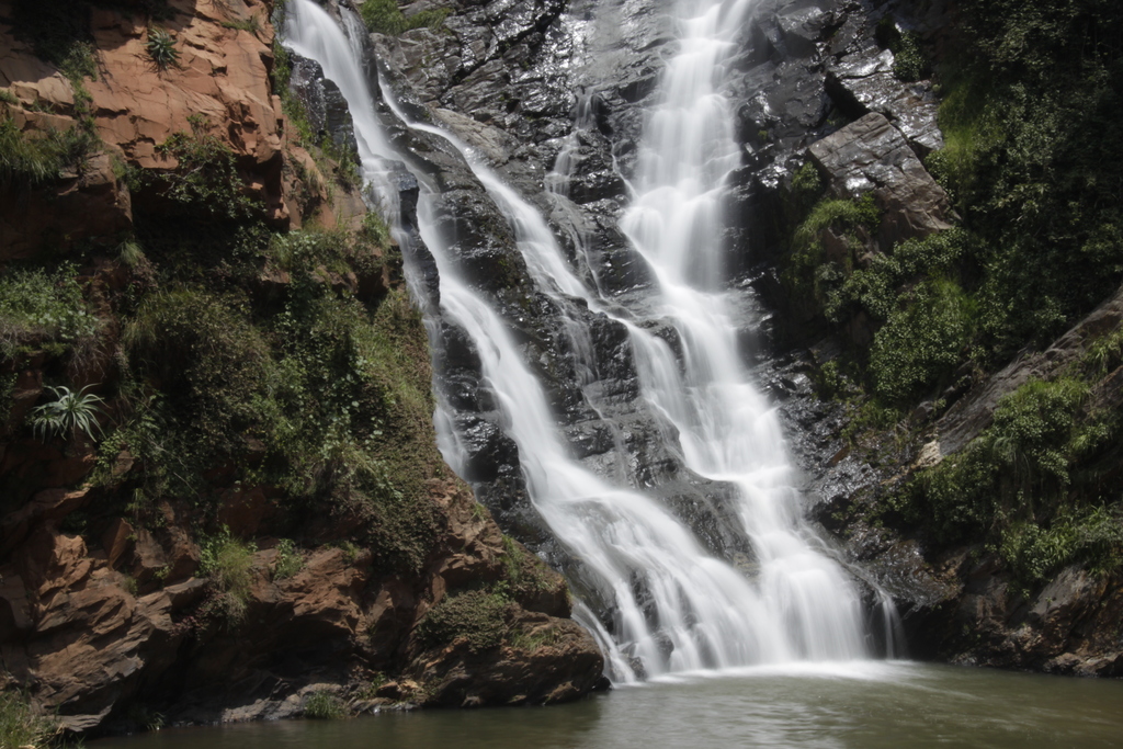
Rooted in a real place.
The foundation's vision began at Walter Sisulu National Botanical Gardens. The moss, water and open sky make a meaningful starting point for its colours—not a decorative theme imposed on its work.
The colours.
Quiet blues, an earthy green and a clear foundation of light and dark. Each has a job.
Let blue carry important statements. Let green make occasional appearances. Use the light and dark neutrals for the reading experience. The photography supplies the human warmth.
The typography.
Hanken
Grotesk.
900 / DISPLAY
Keep the
good going.
The same tightly set, confident headlines as the current site. No new display font.
500 / BODY · 800 / ACTION
A different way to give.
Your gift can keep helping long after the day you give. Simple language, a comfortable reading rhythm, and direct calls to action.
In use.
Existing site language and button shapes, shown with the proposed colours. These are examples on this page only.
Keep the
good going.
We invest donations so Christian ministries can keep caring for people in need.
Give todayA different way to give.
Your gift can keep helping long after the day you give.
Foundation
Place and people.
Keep the waterfall as the foundation's origin. Let its purpose be seen through people and the work it hopes to support.
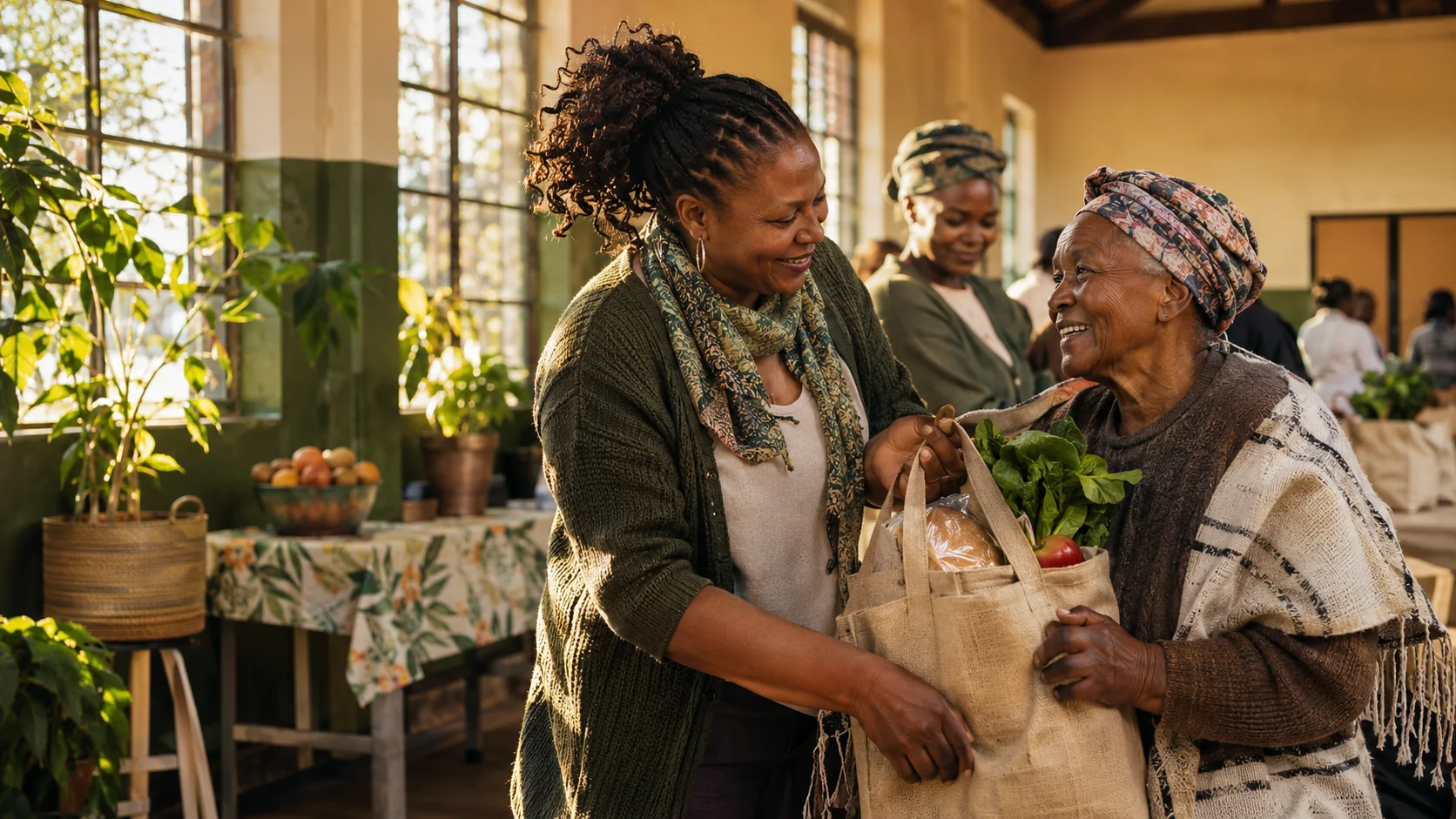
The feeling stays. The colours tell its story.
This is a proposed visual identity, shown separately from the live homepage. The current website, its content, integrations and existing colours remain unchanged. Return to the website ↗